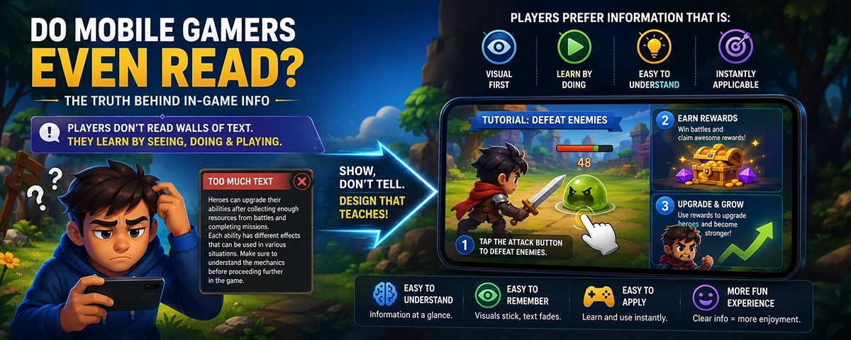
Mobile gamers are not readers. They're hunters. They scan, swipe, and tap the biggest button on screen — then they play. That wall of text your team agonized over? Decoration.
This isn't players being lazy or ungrateful. It's players being entirely rational. The average mobile session lasts about 7 minutes. Nobody spends a quarter of that reading instructions when the actual game is one tap away, fully loaded and ready to go.
Back in 2008, UX researcher Jakob Nielsen ran eye-tracking studies that revealed something striking: desktop web users read in an F-shaped pattern. A strong horizontal sweep across the top, a shorter sweep partway down, then a vertical skim along the left edge. Everything in the middle? Mostly ignored.
The F-Pattern — Where Eyes Actually Land on a Screen
Purple = high attention. Faded = near zero. The middle of your carefully designed UI screen? A ghost town.
That was a desktop user, sitting down, deliberately choosing to read. Mobile gaming is far worse. People play on commutes, in waiting rooms, with one eye on the TV. Deep reading isn't on the agenda.
Here's the reframe that changes everything: you don't need players to read more. You need to design so they don't have to.
"If your players need to read to play your game,— The awkward truth every game team eventually learns
something's wrong with the design — not the players."
There are six main reasons players blow right past your carefully written content — and none of them are about laziness or short attention spans. They're all completely rational behaviors given the context.
Players will find the skip button before they find your NPC's name. If escape is possible, escape will happen. Design for that reality instead of fighting it.
The actual fun is one tap away. Why read instructions when you can just try? Doing is always more compelling than reading about doing — especially on a touchscreen.
Five tutorial notifications in minute one means nothing gets absorbed. The brain hits autopilot and taps through just to clear the noise. Information overload produces zero information.
A wall of text without visual breaks sends one subconscious message: boring. The brain classifies it as low-priority before the first sentence even registers. No amount of good writing survives bad presentation.
People play on commutes, in waiting rooms, half-watching TV. Asking for sustained reading in that context is like assigning homework at a concert. The environment makes deep focus impossible.
If your game looks anything like one they've played before, players skip instructions and assume they've got it. Sometimes they're right. When they're not, chaos follows — and they blame the game, not themselves.
These are the patterns players scan right past — unconsciously, every single time. See how many look familiar.
Welcome to Dragon Realm! Before starting your adventure you must understand the core game mechanics. Your character starts with 100 HP and 20 mana. HP regenerates over time unless you are in active battle. Mana is consumed when you cast spells. To attack an enemy, tap once to select it, then tap again to confirm the action. If you miss the target, the action cancels. Access items from the inventory bag in the bottom-right corner of the main screen. To access the crafting menu, tap the hammer icon which appears only after you reach level 3. Remember to save progress regularly at the save stone in the main village. Your companion gains XP even while you are offline.
200 words. No visuals. Zero players are reading this.
3 things. Each actionable. Teaches through doing.
Activate your HLR multiplier by chaining SPT burst attacks before your CRIT cooldown expires. Max combo chains reset after 3.2s unless the PERK_BUFFER flag is active during PVP_SHIELD phase. Note: synergy bonuses do not apply unless Tier 3 passive is unlocked. ATK multiplier stacking applies to base damage only, excluding elemental resist modifiers from the equipment layer. Chain interrupt events cancel the multiplier stack entirely.
Real words. Zero meaning. Players are already gone.
Same mechanic. Plain English. Actually understood.
These aren't abstract UX theory — they're patterns used by games people actually finish and recommend. Each one trades less text for more understanding.
Progressive Disclosure — Stop Front-Loading Everything
Netflix doesn't show you the settings screen before you've picked a show. Games shouldn't explain the crafting system before you've swung a sword. Teach one thing, let the player do it, then teach the next. Information delivered at the exact moment it's needed is information that actually sticks.
Try this: Map every tutorial element to an action timeline. If you're explaining crafting before the player has even moved, you're ten minutes early. Delay it until the moment it becomes relevant — no earlier, no later.
Just-In-Time Info — Contextual Beats Front-Loaded
A "?" icon that explains a stat when the player taps it beats a tutorial that explains all stats at minute zero. People don't want information — they want answers to questions they're already asking. Show the tooltip when they're looking at the stat. Show the upgrade guide when they're standing at the upgrade screen. Match the moment, not the onboarding checklist.
Show, Don't Tell — Guided Action Over Instructions
Instead of writing "tap the Upgrade button to level up your hero," add a pulsing arrow and let them do it. Gesture plus animation beats written instruction every single time. Monument Valley is a masterclass: almost zero text, entirely learnable through touch. Players feel clever for figuring it out — which is exactly the feeling every game should create.
The 3-Second Glance Test
Before shipping any UI screen, cover up all the text. Can you tell what the screen is for in 3 seconds? If not, the visual hierarchy is broken and your copy is doing too much weight-lifting. Good design communicates before words appear. Layout, icons, and color should do the heavy lifting — text is the finishing detail, not the main event.
The actual test: Hand your screen to someone who's never played. Don't say anything. Three seconds. What do they think this screen does? If they're wrong, that's a design problem — not a reading problem.
The 3–30–3 Rule — Layer Your Tutorial Depth
Design three layers and let players self-select into the one they actually need:
Most players only ever touch the 3-second version. Design that first. Add depth for the people who genuinely want it — don't make the majority sit through the minority's experience.
Chunking + Visual Anchors — One Idea Per Card
The brain processes images roughly 60,000× faster than text. Give every block of information a visual partner — an icon, a screenshot, an animation frame. One idea per card. Two lines per chunk maximum. White space isn't wasted — it's the breathing room that lets the eye land, register, and move on without losing the thread.
Fast rule: If any chunk of UI copy runs longer than two sentences, it can probably be cut in half. Read it out loud. Does it sound like how a person actually talks? If not, rewrite it until it does.
Write Like a Human, Not a Manual
Mobile game copy should aim for a 6th-grade reading level — not because players are unsophisticated, but because fast, clear language is just better language. Every word that can be cut should be cut. Before-and-after says it best:
Smart Defaults Over Long Explanations
If you're writing a paragraph explaining a setting, ask: what if you just set the right default? The best feature is often the one nobody has to read about — because the game already made the smart choice. Players shouldn't need to understand a toggle to benefit from good design. Smart defaults reduce cognitive load and make everything feel effortless — which is exactly what every mobile game should feel like.
Example: Don't add a "Reduce effects for better performance" toggle with a two-paragraph explanation. Detect the device's performance tier and set it automatically. The explanation only existed because the design wasn't doing its job.
One card preview, one battle — you understand the entire game in under 60 seconds. No text walls, no tutorials. Cards explain themselves through icon, number, and one punchy line.
Show mechanic → let them try it
Near-zero text. Entirely learnable by touch. Players feel clever for figuring it out because the design does all the teaching. Still the gold standard for "no instructions needed" game design.
Zero tutorials, pure intuition
Deceptively simple language. "Match 3." "Fill the bar." "Clear the jelly." Anyone aged 8 to 80 gets it instantly. Levels get diabolically complex — the words never do.
6-word goals everyone understands
Mind-bendingly complex card interactions described in plain English. "Deal 3 damage." "Give a minion +2 attack." No jargon, no external manual required. Complexity that teaches itself.
Complex mechanics, simple sentences